Machine Learning - Linear Regression
A simple generic prediction
Maybe the most simple generic prediction is a collection of points, and a linear regression (when applicable) pointing to the future.
However, aside from the uncertainty that surrounds most predictions, problem happens all the time along the way. In the very recent years, Covid-19, Russia invasion, and finally, China's lockdown again, and maybe this is not the last impacting event for the early 2020's.
Which means that predictions have to be updated all the time. And it is also important to get track of the previous predictions for comparison and for impact analysis.
Linear Regression
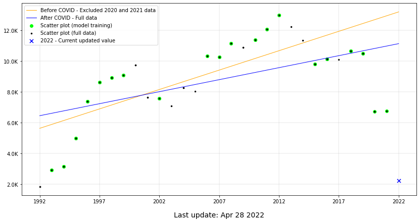
The chart bellow can represent anything that relates to the stated use case above. Two lines which slopes varies, due to a great variation caused by an extremes events.
This model was used for the purpose of the exploration of the Scikit Learn library. The depicted problem is a time series, but the result variable has influence of other factors beyond the years interval. It is not just a simple linear relation, but it applies for the purpose of the example.
There are many other use cases to predict future data, based on impacting events. Some examples can be the number of security incidents after the adoption of security measures, the production of some part after an industry buys new machinery.

Commented Code
Common data science libraries
Importing Scikit Learn, NumPy, Pandas, Matplotlib
import numpy as np
import pandas as pd
import json, datetime

from sklearn import linear_model
from sklearn.model_selection import train_test_split
from sklearn.metrics import mean_absolute_error, r2_score

import matplotlib.pyplot as plt
from matplotlib.ticker import FuncFormatter
About the dataset
This test relies on public data available on the open government initiative of the State of São Paulo - Brazil.
Quicknote - The information below can be used as a feature, in an updated version of this regression. This is an open data of the financial funds transfered monthly, from the State of São Paulo to FAPESP, and may have a high correlation with the related regression.
Repasses Financeiros à FAPESP_2005 a 2022 CONSOLIDADOAny results, partial information or charts presented here should not be interpreted as official information. These is just machine learning technology test. For official data, check the links above.
data_from_json = json.loads(
'{"format_compatible": [["1992", 1148, 716], ["1993", 1647, 1273], ["1994", 1928, 1232], ["1995", 3141, 1855], ["1996", 4177, 3204], ["1997", 4268, 4351], ["1998", 3964, 4952], ["1999", 4013, 5081], ["2000", 3848, 5880], ["2001", 3222, 4428], ["2002", 3057, 4536], ["2003", 2821, 4253], ["2004", 3412, 4850], ["2005", 3265, 4764], ["2006", 4218, 6108], ["2007", 4374, 5892], ["2008", 4495, 6638], ["2009", 3977, 6912], ["2010", 4420, 6953], ["2011", 4589, 7468], ["2012", 4515, 8471], ["2013", 4256, 7962], ["2014", 4118, 7216], ["2015", 3656, 6153], ["2016", 3646, 6496], ["2017", 3471, 6643], ["2018", 3483, 7165], ["2019", 3235, 7256], ["2020", 1749, 4991], ["2021", 1700, 5058], ["2022", 645, 1608]]}')
df = pd.DataFrame(data_from_json['format_compatible'], columns = ['date', 'research_grants', 'scholarships'])
df['total'] = df['research_grants'] + df['scholarships']
df = df.apply(pd.to_numeric)
Model Training
SciKit Learn methods to split and train data and test the model. To make possible the comparison between the two models, the same date were used for training. Except that for the model of the first period, the data didn't include the Covid-19 most critical period of the years 2020 and 2021.
The second model include all data from the first model plus the Covid-19 critical years.
The last point is the current year, 2022. And of course this data can be attached to an updated data, daily for instance, so you can follow what the model has predicted. And never forget to filter the data to be predicted from the training model.
""" Training data until 2019 - Before COVID """

df_up_to_2019 = df[df['date']<= 2019]

# Get X values
X_2019 = (df_up_to_2019.index -  df_up_to_2019.index[0]).values.reshape(-1, 1)
y_2019 = df_up_to_2019.total

# Linear Regression
X_2019_train, X_2019_test, y_2019_train, y_2019_test = train_test_split(
    X_2019, y_2019, test_size=0.33, random_state=42)
regr_2019 = linear_model.LinearRegression()
regr_2019.fit(X_2019_train, y_2019_train)

# Normalize lenght
b = np.array([[28], [29], [30]])
X_2019 = np.concatenate((X_2019, b))
y_2019_pred = regr_2019.predict(X_2019)


""" Training full data, up to 2021 to measure COVID impact """
df_up_to_2021 = df[df['date'] < 2022]

# Get X values
X = (df_up_to_2021.index -  df_up_to_2021.index[0]).values.reshape(-1, 1)
y = df_up_to_2021.total

# Linear Regression
_, X_test, _, y_test = train_test_split(
    X, y, test_size=0.33, random_state=42)
regr = linear_model.LinearRegression()

# Add 2020/2021 data
X_train = np.concatenate((X_2019_train, X[-1:-3:-1]))
y_train = np.concatenate((y_2019_train, y[-1:-3:-1]))
regr.fit(X_train, y_train)

# Normalize lenght
b = np.array([[30]])
X = np.concatenate((X, b))
y_pred = regr.predict(X)


# Current value - 2022
total_corrente = df[df['date'] == 2022]['total']
Plot chart
The most important informations ploted on the chart are placed in the legend area, at the top left corner. But it is important to highlight some already writen topics.
The orange line was drawn over the green dots, used to train the model between 1922 and 2019 (inclusive). The blue line was trained with the same dots of the orange line, including the years 2020 and 2021.
That is because the sample data is small and can make the comparison bad, in the case that the training data for both cases differentiates much.
 import warnings
    warnings.filterwarnings('ignore')

    plt.figure(figsize=(14,7))
    plt.scatter([X[-1]],
                total_corrente,
                color="blue", s=50,
                marker="x",
                label = '2022 - Current updated value')

    ## Before COVID
    plt.plot(X_2019,
             y_2019_pred,
             color="orange",
             linewidth=1,
             label = 'Before COVID - Excluded 2020 and 2021 data')

    plt.scatter(X_2019_train, y_2019_train, color="#00FF00")


    ## After COVID
    plt.plot(X,
             y_pred,
             color="blue",
             linewidth=1,
             label = 'After COVID - Full data')

    plt.scatter(X_train, y_train, color="#00FF00", label = 'Scatter plot (model training)')

    ## Full data = Test data + train data
    plt.scatter(X_train, y_train, color="k", s=6)
    plt.scatter(X_2019_train, y_2019_train, color="k", s=6)
    plt.scatter(X_2019_test, y_2019_test, color="k", s=6)
    plt.scatter(X_test, y_test, color="k", s=6, label = 'Scatter plot (full data)')


    # Chart details - grid, axis, labels
    plt.grid(lw=0.3)
    ax = plt.gca()
    ax.set_xticklabels(['0', '1992', '1997', '2002', '2007', '2012', '2017', '2022'])

    def human_format(num, pos):
        magnitude = 0
        while abs(num) >= 1000:
            magnitude += 1
            num /= 1000.0
        # Format Y tick label volums
        return '%.1f%s' % (num, ['', 'K', 'M', 'G', 'T', 'P'][magnitude])

    formatter = FuncFormatter(human_format)
    ax.yaxis.set_major_formatter(formatter)

    last_update = 'Last update: {}'.format(str(datetime.date.today().strftime("%b %d %Y")))
    plt.xlabel(last_update, labelpad=15)
    plt.rc('axes', labelsize=14)

    handles, labels = plt.gca().get_legend_handles_labels()
    order = [1,2,3,4,0]
    plt.legend([handles[idx] for idx in order],[labels[idx] for idx in order])

    plt.show()

Model Evaluation
SciKit Learn methods to evaluate Machine Learning models.
This study aimed to make the right usage of the librarie's API, and to make use of a simple datasource to demonstrate in a simple manner, how to obtain useful information.
The use of the same data for trainning for both models, only adding data to the second model, may have caused the Coefficient of determination of the second model decrease.
Gradually, I will test other models to try to incremente the evaluation result and improve the overall results.
print("Coefficients: ", human_format(regr_2019.coef_[0], 0))
print("Intercept: ", human_format(regr_2019.intercept_, 0))
mae = mean_absolute_error(y_2019, y_2019_pred[:len(y_2019)])
print("Mean absolute error: %s" % human_format(mae, 0))
print("Coefficient of determination: %.2f" % r2_score(y_2019, y_2019_pred[:len(y_2019)]))

print("\n\n")

print("COVID years included - Up to 2021")
print("Coefficients: ", human_format(regr.coef_[0], 0))
print("Intercept: ", human_format(regr.intercept_, 0))
mae = mean_absolute_error(y,  y_pred[:len(y)])
print("Mean absolute error: %s" % human_format(mae, 0))
print("Coefficient of determination: %.2f" % r2_score(y, y_pred[:len(y)],))
Pre-COVID years - Up to 2019
Coefficients:  251.9
Intercept:  5.6K
Mean absolute error: 1.5K
Coefficient of determination: 0.62

COVID years included - Up to 2021
Coefficients:  155.9
Intercept:  6.5K
Mean absolute error: 1.7K
Coefficient of determination: 0.36